The following post was written by our manufacturing partner, Enilinx.
Like many hardware engineers, our starting instinct about chassis design was very practical. You import the 3D models into CAD, try a few arrangements, make sure the parts stack cleanly, check that the electrical connections still make sense, and then draw the smallest possible shell around everything. Add a lid, close the box, and move on.
For prototypes and internal projects, that approach is often enough. The chassis only needs to satisfy its first requirement: get everything into a box. You may not need an internal frame, screw bosses, clips, tuned radii, or carefully shaped pockets and platforms. A flat plate and a folded edge can do the job.
Flow asked more of us. When we stopped looking at it only as engineers and started asking what kind of device we would actually want to use, the questions changed. Some were harder than the electrical or mechanical problems themselves. They also had a larger effect on cost, schedule, manufacturing effort, and the kind of product Flow could become.
Early in the project, we hadn’t worked on a product with this kind of surface-area-to-thickness ratio. But it was clear what people would expect from a display: narrow bezels, a thin body, and as little weight as possible. Those constraints left little room for styling as decoration. So instead of asking how to make Flow look designed, we spent more time asking how it should feel to use.
After trying a few devices with similar proportions, the problems came into focus quickly. Some of the most frustrating parts of using a display have almost nothing to do with the panel itself: a cable that sticks out from the wrong place, a stand locked to a single angle that sits too low, or on-screen display (OSD) buttons that are hard to find and unpleasant to press. Nearly every monitor has some version of this problem.
Most of the time, those details stay invisible. They usually don’t decide the sale. That may be why large brands rarely spend much time refining them. But the moment you carry the device outside, adjust its position, or change a setting in the OSD menu, the compromises become very noticeable. They interrupt the experience.
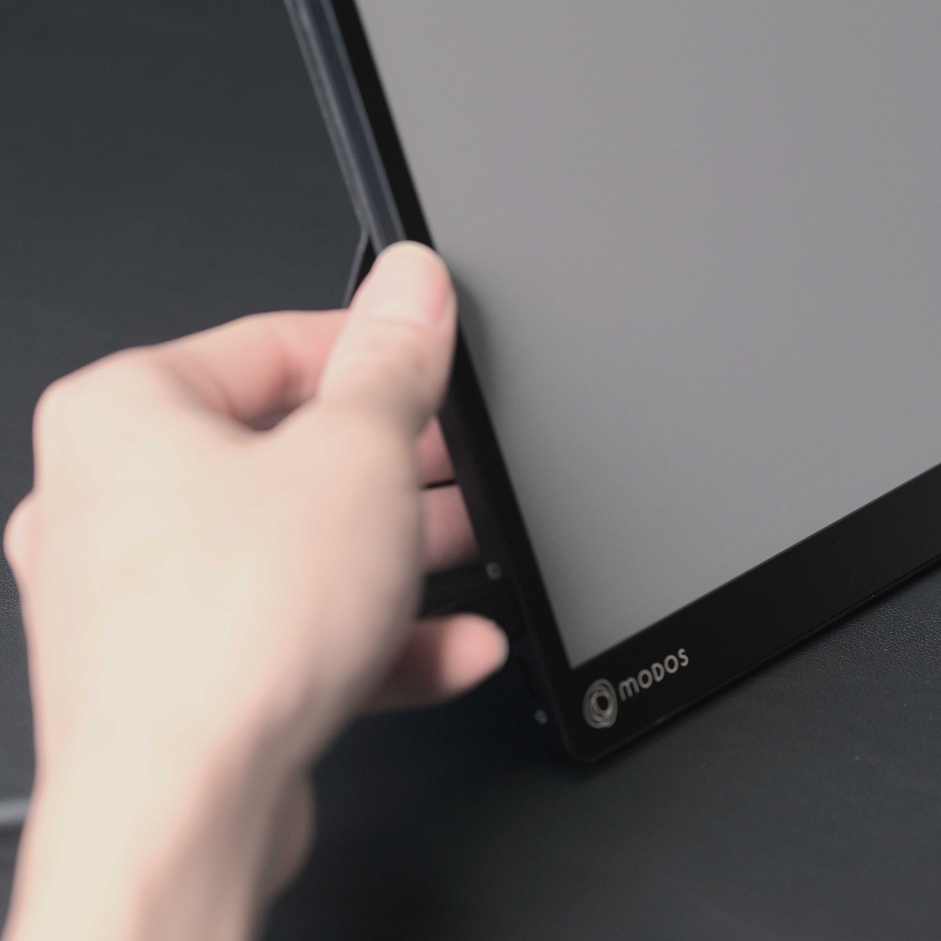
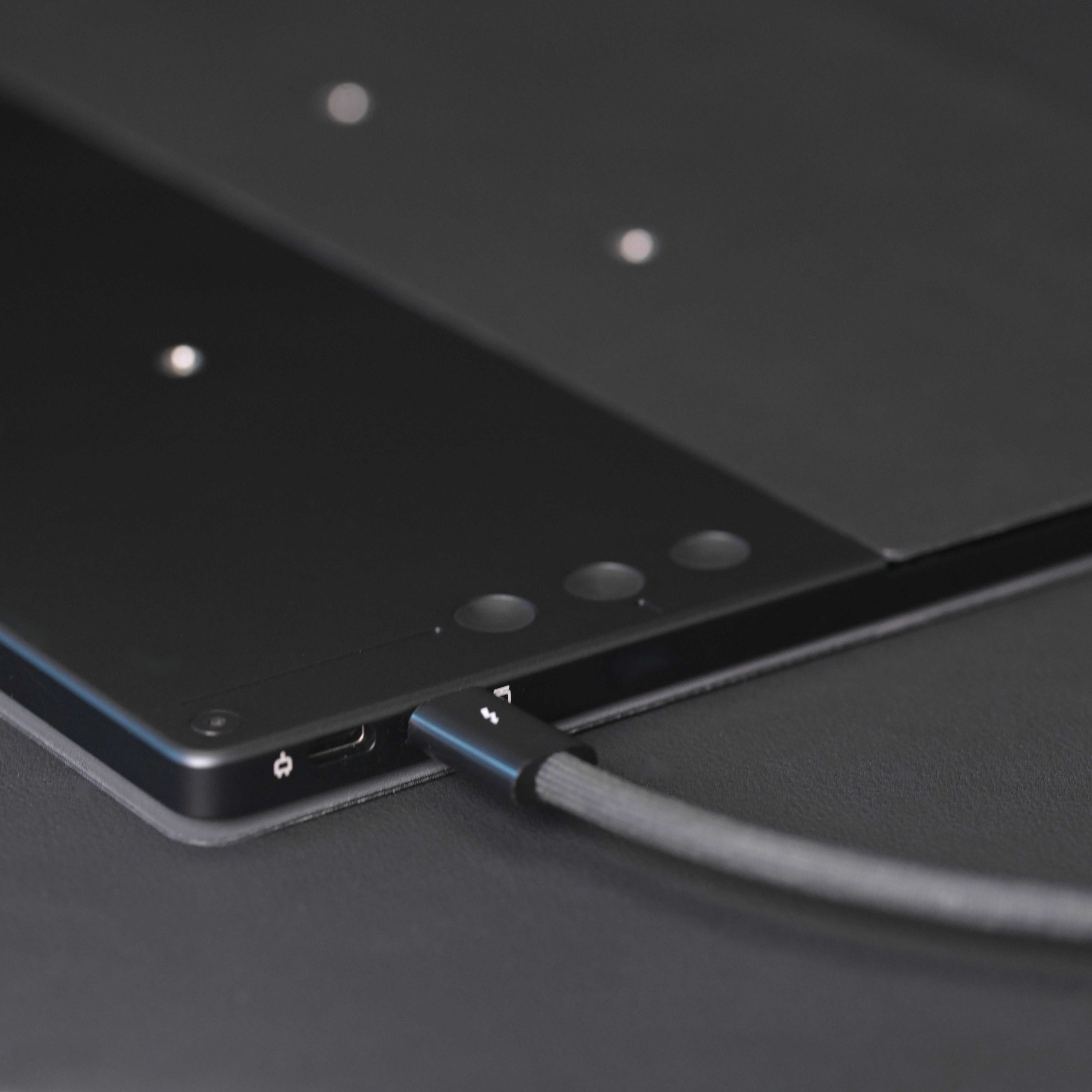
We didn’t want Flow to become that kind of object, the one people quietly resent in small moments. So we tried to clean up the details wherever we could. Routing the cable from the lower-left corner was straightforward. There was still room for the 75 mm VESA mounting nuts. The rear buttons needed more thought. The stand was the hardest part.
Kickstand
We considered building a stand directly into the device, but it would have made the design harder to assemble and source. Since Flow already needed a protective case, we decided to put the stand there instead.
The case stand had to do one thing well: hold Flow at useful angles without feeling flimsy or improvised. We tried many folding structures before settling on a design with an internal damped hinge. It gives Flow stable angle adjustment and a much more solid feel in use, closer to a built-in kickstand than a folded cover.
It’s not a perfect solution. It’s expensive. It’s not the cleanest visually. It also adds a meaningful amount of weight, to the point that the case is almost as heavy as the device itself. But in daily use, it makes the device feel more settled and more dependable.

OSD Buttons
The earliest OSD design used three buttons on the side of the chassis. Once we had a prototype in hand, the problem was obvious. Unless the other hand was holding the opposite side of the display, pressing a side button pushed the screen away, or at least knocked it out of position. The fingers had to work against the buttons rather than naturally finding them.
That didn’t feel like a good interaction.
Like most ultra-thin devices, Flow didn’t have room for front-facing buttons unless we made the bezel wider and the device larger just to fit three controls. But when we paid attention to how people naturally approached the device, it became clear that the first gesture was usually to pick it up. More specifically, it was a one-handed pinch on a thin object. In that gesture, three fingers naturally land on the back of the chassis. That made the rear surface the most sensible place for the controls.
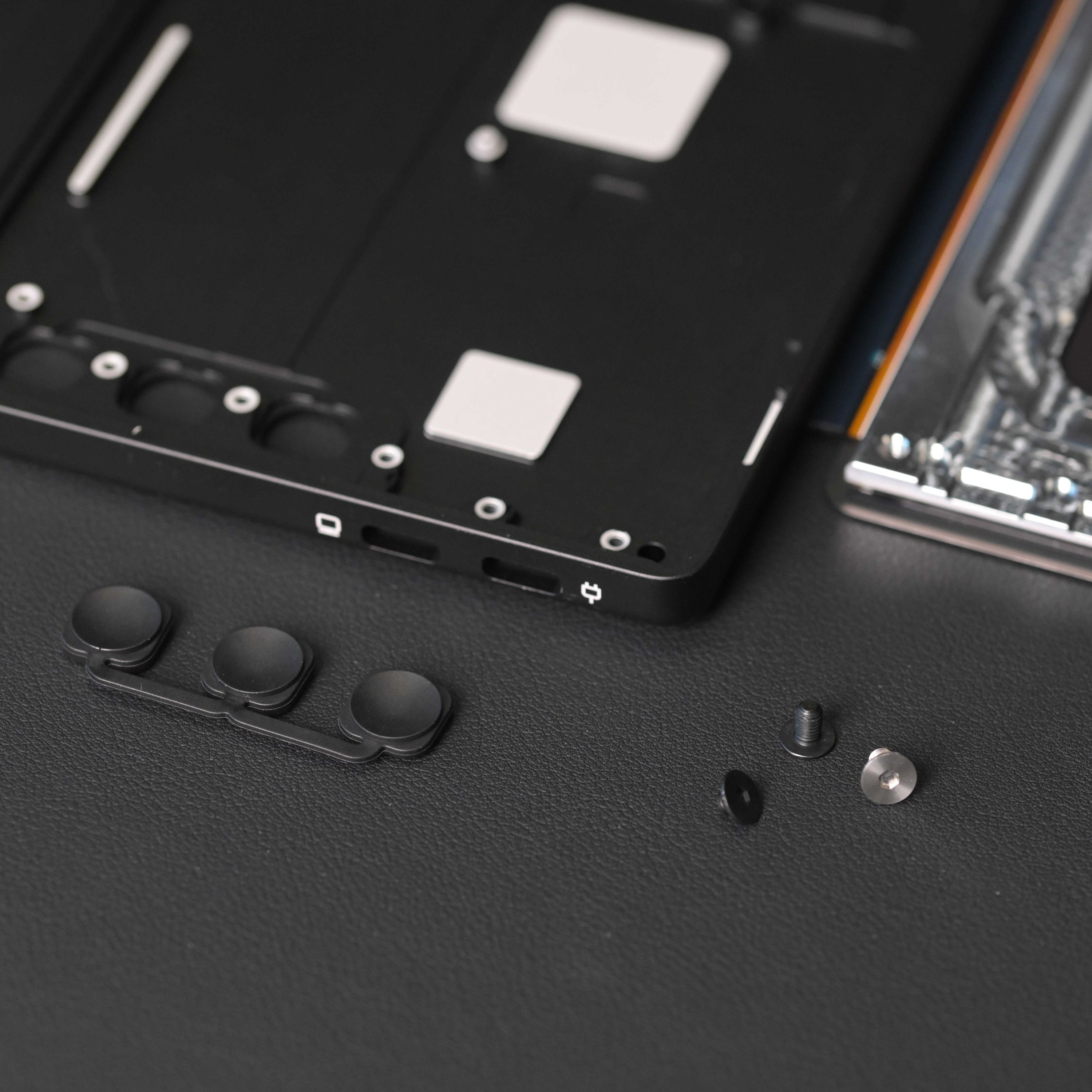
That choice created its own problems. The buttons had to be extremely thin, which made manufacturing and assembly more difficult. Hard buttons also produced a loud, brittle click when they hit the thin chassis, almost as if the screen were about to crack. And because the buttons were on the back, they had to be distinguishable by touch alone.
In the end, we made a custom injection mold for soft rubber buttons. They still give a clear click response, but without the sharp mechanical sound. We also added recessed guiding lines near one of the buttons, so users can find the controls by touch without hunting for them.
Combined with the touchscreen OSD menu Wenting implemented, those controls make it much easier to switch between display modes tuned for specific situations.
Form Factor
Flow’s form factor is probably the least designed part of the product. The narrow aluminum frame gives it a high screen-to-body ratio. Once we balanced thinness, weight, and strength, the bezel size was largely set. The USB-C port then established the minimum thickness.
That didn’t leave much room for stylistic choices. What we could do was reduce the thickness on half of the device, so the magnetic protective case would feel like part of the product instead of an extra layer added afterward. The goal wasn’t simply to reduce a number on a spec sheet. It was to make Flow feel thinner where people actually notice it: when they pick it up, carry it, or slide it into a bag.
Detachable and Repairable Design
The earliest design wasn’t detachable. We also had the usual instinct to defend the modern electronics playbook: if a product needs to be thin, light, and tightly integrated, then a ring of double-sided adhesive can start to look like the cleanest answer to everything.
But once we tried the alternatives, the tradeoff looked less rigid than it first seemed. A detachable structure didn’t require the device to become thicker. Custom screws preserved much of the visual integrity of the back. Moving some material from the outer shell into the protective frame didn’t create a major weight penalty. Assembly became a little more complicated, but it stayed manageable.
More importantly, a detachable structure makes service possible without turning the whole product into waste. Flow’s rear screw design isn’t exotic. It’s one of the simplest and most obvious approaches. That’s exactly the point.
Companies that build phones and tablets have far more engineering resources at their disposal, yet many still choose not to pursue that balance. Many products could strike a better balance between repairability, longevity, and visual design if their manufacturers chose to pursue it. reMarkable Paper Pro is a useful example: it remains extremely thin, about the same thickness as a USB-C port, yet the screen can still be removed easily after taking out a few hidden screws.
Repairability is likely less an engineering question than a decision about cost, margin, and planned obsolescence.
Afterthoughts
Many of Flow’s design decisions aren’t especially dramatic. They didn’t come from a sudden creative breakthrough or some rare technical insight. Most of them are straightforward. They simply take attention and effort.
That is exactly where product design often lives. Surface finish, corner radius, material durability, software stability, color calibration, button feel, cable routing, stand angle adjustment: each one looks minor in isolation. The effect of any single decision is limited enough that it can be hard to justify commercially. Only a few brands seem willing to spend time and money refining details like these.
There are many more examples in the same category. We adjusted the ink color several times so the printed areas would match the white of the E Ink panel. We fit the VESA nuts into an extremely thin body. We also chose a more premium case material because we wanted the cover to age well, not simply look good when it was new. None of these choices is easy to market. They are small, quiet decisions, but they shape how the product feels after the first few minutes of use.
If we had treated Flow only as a carrier for the technology, we could have wired the components together, fixed them inside an aluminum box with double-sided tape, and finished the design in a fraction of the time. It would also have been much cheaper and far easier to manufacture.
The difference between good technology and a good product is found in exactly these choices.
When the electronics, software, and the rest of the experience come together inside this chassis, it reaches the user as a complete product. We don’t expect anyone to notice how many cutouts are hidden in the aluminum, or to admire the chassis as an artistic object. The better outcome is quieter than that. The device works. The details stay out of the way. Flow becomes a natural part of daily life.