Project update 13 of 21
Statistics
Hiya!
Such a boring update title. Boooring! Nevertheless, campaign statistics are what this update is going to be about, hoping that some results might still be interesting. You might be just curious in general, or maybe you’re planning a crowdfunding campaign in the future, who knows. Anyway, I wanted to look at these things either way, and since I’ve already collected the data, I thought I’ll just share it with you.
Fair warning, statistics exam was one of only two that I had to repeat during my university studies, so I’m not very good at this stuff. Considering that, let’s do some warm-up first.
I asked Crowd Supply to give me an anonymized export of pledges. What I got was a CSV export with the Pledge Tier, Shipping Options (registered or standard), Pledge Timestamp, Quantity, and Country. Perfect.
First let’s see where orders came from around the world. I colored all countries where I will have to ship to. (Click on the images in this update to get larger versions.)
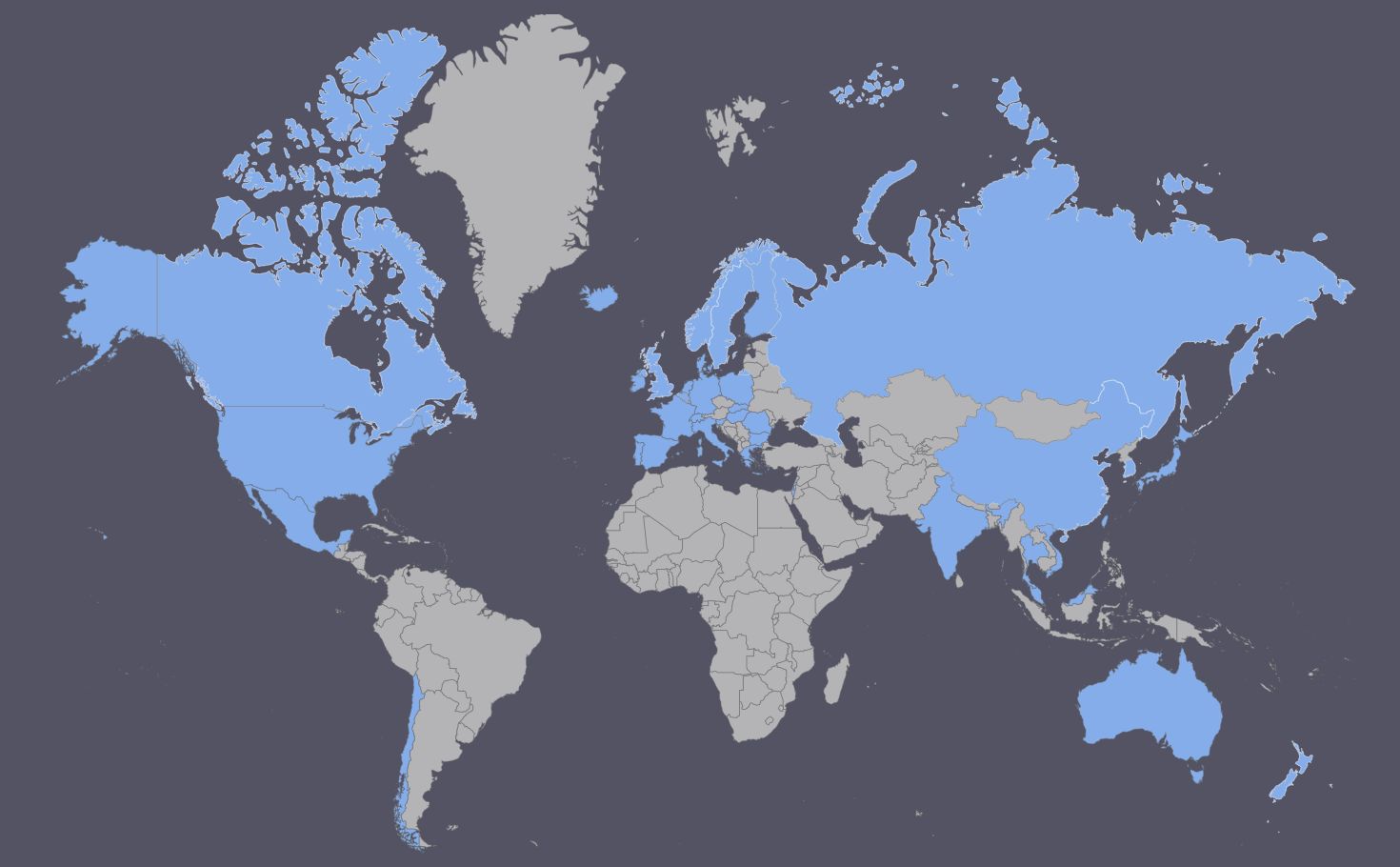
Not bad eh? Well, Russia is mostly a lie, as due to the country’s size, it looks like as if I will be shipping to most of Asia. In reality, I only have 3 backers from Russia. So while this map looks cool, let’s try a different approach.
Which are the 10 countries with the most backers?
| Country | # of Pledges | % of all Pledges |
|---|---|---|
| United States | 145 | 34,4% |
| Germany | 73 | 17,3% |
| Australia | 27 | 6,4% |
| Canada | 23 | 5,5% |
| United Kingdom | 22 | 5,2% |
| Switzerland | 20 | 4,7% |
| Sweden | 11 | 2,6% |
| France | 10 | 2,4% |
| Austria | 9 | 2,1% |
| New Zealand | 8 | 1,9% |
Now, I’ll lump Germany, Austria and Switzerland together because they are all neighbors and hence close to each other, they all speak the same language (yes I know Switzerland also has two other official languages, but I’ll call it my poetic liberty to still do so), and they are in the same timezone. I’ll call them "German Europe". Then the table looks like this.
| Country | # of Pledges | % of all Pledges |
|---|---|---|
| United States | 145 | 34,4% |
| German Europe | 102 | 24,1% |
| Australia | 27 | 6,4% |
| Canada | 23 | 5,5% |
| United Kingdom | 22 | 5,2% |
| Sweden | 11 | 2,6% |
| France | 10 | 2,4% |
| New Zealand | 8 | 1,9% |
| Netherlands | 7 | 1,7% |
| Italy | 6 | 1,4% |
American, German, and Australian sites / forums were the ones I was most active in during the campaign, and this clearly shows in the statistics.
Now, let’s look at a different question. How fast did I gather backers as time progressed?
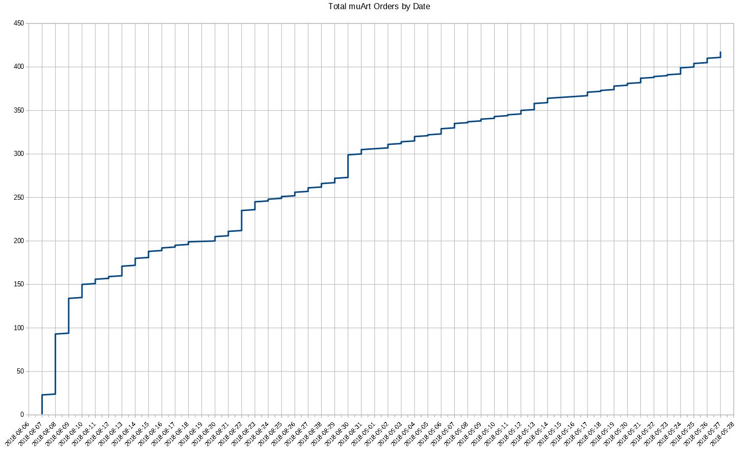
For me, this above graph has two really interesting pieces of information. Initially there was rapid growth as the campaign started and many of those who requested an e-mail reminder pledged right at the start. This is kind of expected. What surprised me is what happened after that. Nothing! The number of pledges just kept increasing pretty linearly until the funding period ended. There were occasional jumps here and there due to project updates and articles published by external sites, but I would have expected the curve to gradually taper off until it plateaus, but no, it stays pretty linear all the way to the end. This is good news to me, because this tells me market saturation is possibly far away. I just need to keep bringing in more people if I want to continue this trend, and the above graph tells me I should be able to do so.
The other interesting question in the same graph is, what are the reasons for the greater jumps / rushes in the middle? I know I already said updates and articles, but which ones? Let’s correlate the dates of the jumps with publishing dates.
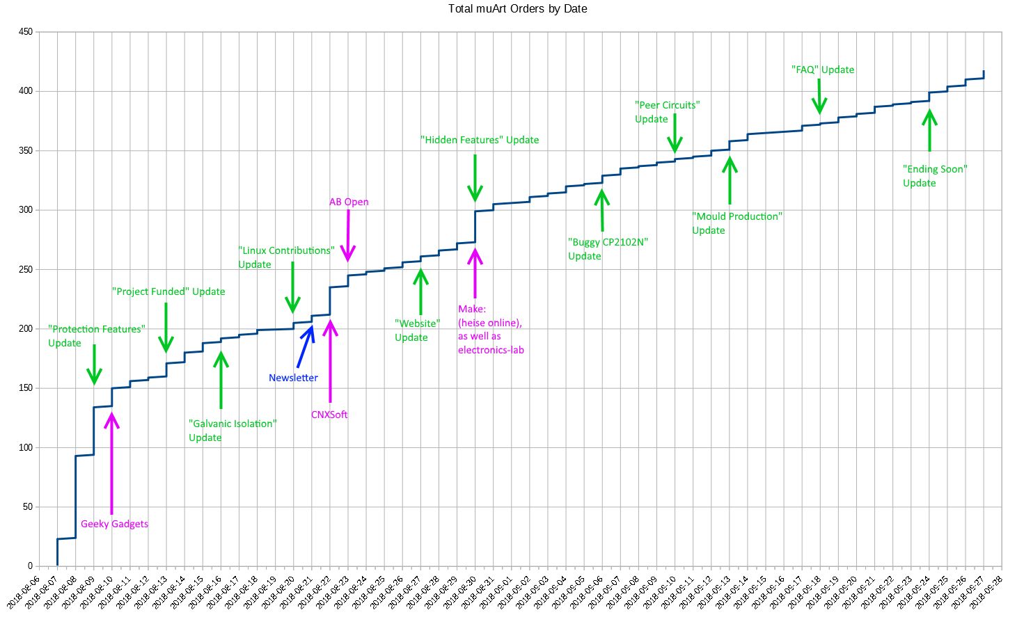
It seems obvious that project updates won’t immediately bring new backers, because people have to hear from your campaign first and come in to be able to view the updates at all, but still, I was expecting a bit greater immediate effect. Don’t get me wrong. Project updates are super important, they help in building trust, they keep backers up-to-date, and they add bonus material to the product and thus increase its long-term value. Also, Crowd Supply tells me it is common for projects with irregular updates to experience more plateaus and earlier plateaus. But the updates’ immediate effect is much smaller than that of external articles, and to my surprise, almost unrecognizable in the graph. Had I not kept a close eye on the live counters after updates during the campaign, I wouldn’t even be able to tell which update was better received than others just by looking at the image above. Takeaway for future crowdfunders: External articles are more important than you think to get pledges fast during the funding period, but don’t forget you need the updates, too, for their long-term effect.
New topic: Which time of day do people like to pledge? Asking this while looking at all the pledges from around the world is pointless, as people live in different timezones, and I will not do all the timezone conversions for every possible country to bring them to a comparable timebase. So since most pledges come from the US, let’s look at them first. In the following histograms, all times are given in UTC.
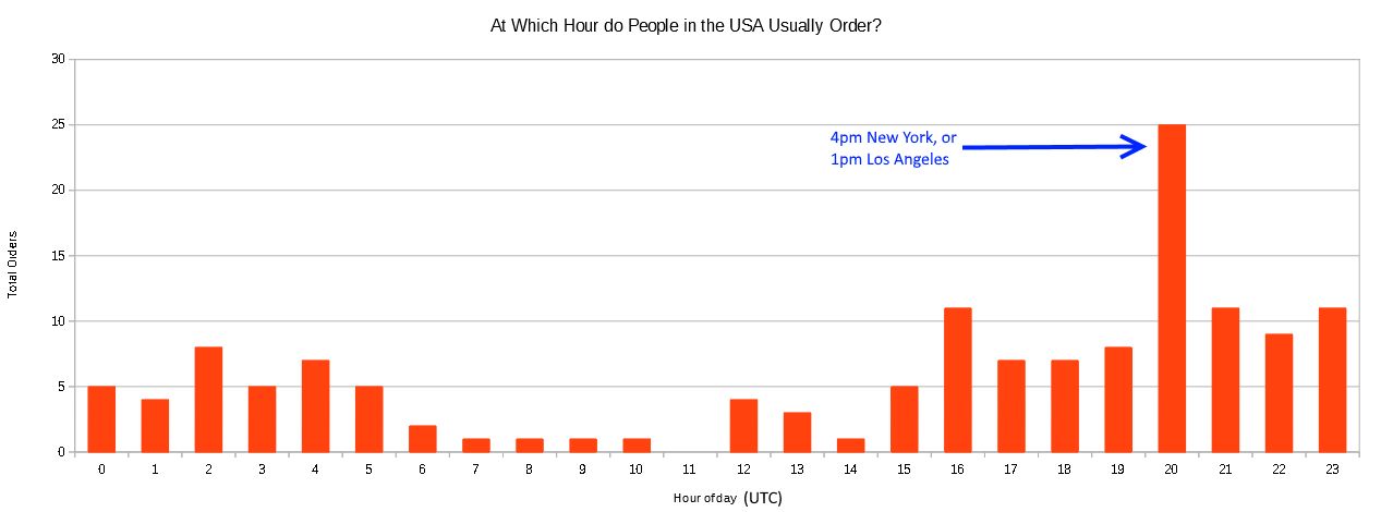
I quickly realized America also has multiple timezones. So what about Germany in Europe?
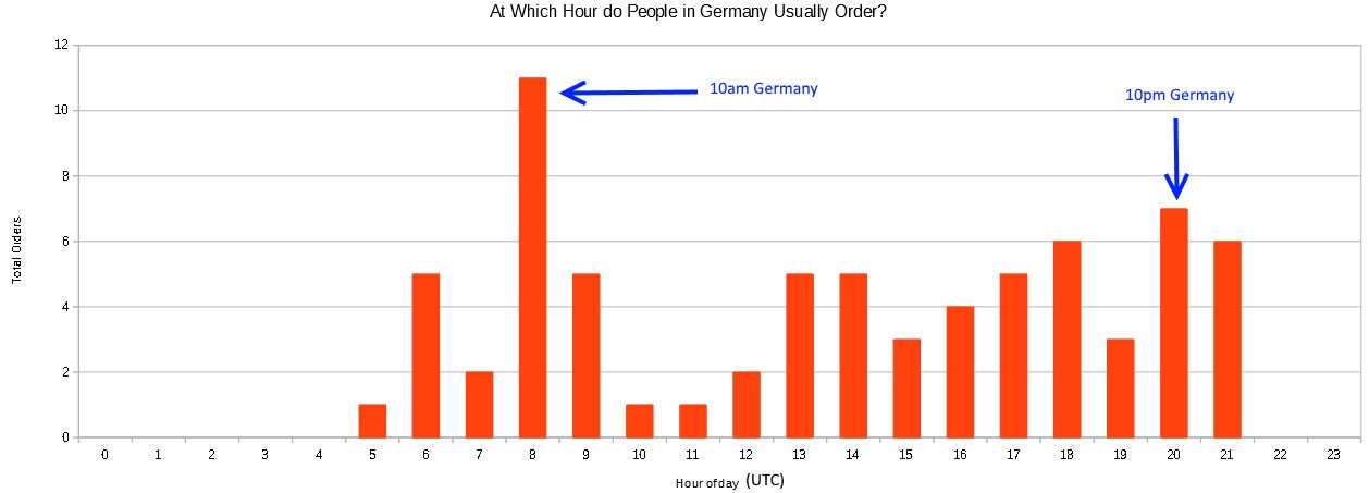
Whaaat? American and European people like to pledge at totally different times during the day. People in the US prefer doing so sometime during the afternoon, while Europeans pledge before noon and in the evening.
Changing topic again: It seems intuitive that people are more likely to choose registered shipping the greater the pledge value is. But is that really so?
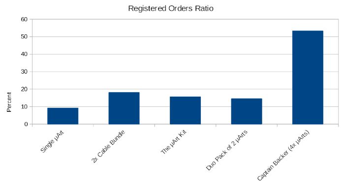
In the bar graph above, the pledge tiers are sorted by value in increasing order. Still, with the exception of the highest tier, there is no correlation between the tier and shipping options. If anything, it is decreasing, not increasing! So it seems instead of a general and continuous relationship between pledge value and registered shipments, there might be some psychological threshold above which people simply click and start going for safer shipments.
By the way, about 6x more people chose to pledge for a full kit (including cables) instead of just a μArt without cables. Before the campaign, I thought it would be the other way around, with only a small amount of people going for the cables. I couldn’t have been more wrong, which makes a difference for me as I have to lay out the supply chain a bit differently than originally planned. Not a biggy, but I was thoroughly surprised.
Now something funny. I was curious if the country you live in has anything to do with the number of pledges you are going to make. The next graph shows the percentage of bulk buyers by country, where I define a "bulk buyer" pretty liberally as anybody who orders more than one of the same pledge level. I only included the four top countries with the most backers, as all the others have so few that there is no statistical significance in them.
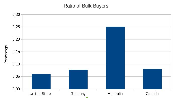
Guess what! In most countries, only around 5-8% of their backers order more of the same pledge level. Not Australia, where every fourth person buys in "bulk". LOL. Let me know if you have an idea for a possible reason.
Okay, I’ll wrap this update up now. I hope you found it interesting. If you want to see more numbers, let me know what else could be interesting, and I’ll see if I can extract it from the raw data I have. Until the next update, Cheerio!